| Subtotal | $0.00 |
USD
U.S. DollarEuroBritish PoundCanadian DollarsAustralian DollarsIndian RupeesChina Yuan RMBMore Info →

| Subtotal | $0.00 |

Wouldn't it be great if converting interested parties into paying customers were as simple as sending them directly to a product page? Unfortunately, that's not how it goes most of the time. The majority of people online need some encouragement before making a purchase. Closing each sale involves promoting a product or service properly. In many cases, you will need to generate and nurture leads until they are ready to purchase.
You might be wondering, "Why can't my homepage do that?"
The fact is it's just too distracting.
Your homepage has to wear a lot of hats by necessity. It introduces people to your brand, tells people about your products or services, and frequently serves to highlight news about your company.
This multitasking can clutter the minds of visitors with too many options. A landing page has one goal: to convert traffic by focusing on a single topic or offer. To do this well, the success of a landing page boils down to the strength of the content and design. You want to pique a reader's interest with the copy and visuals, inspire them into action with the other elements on the page, and hook them with an incentive.
Let's say you've spent time capturing people's attention through paid ads and organic marketing to bring them to your landing page. There are two ways this can play out.
Scenario A sounds better, doesn't it? That's why you need to take the time to get your landing pages right.
This guide explores the essential components of a landing page that converts. You'll learn how to build one, and crucially, how to measure your efforts and optimize the page to appeal to the highest number of people.
Landing pages are individual pages on a website that encourage people to perform just a single action. Marketers use them to capture leads or drive sales.
Yes, visitors land on your homepage. It's probably the most visited page on your website, especially if you have an established brand. A landing page isn’t designed to compete with that. They're designed instead to receive specific campaign traffic and to convert that traffic.
A homepage pulls in traffic from sources all over the web. To do this, it needs to be flexible enough to satisfy a range of visitor needs. When a visitor arrives at your website's homepage, they have so many options that they are far less likely to stay on your intended pathway. Take your typical homepage: you've got multiple CTAs, image sliders, page navigation, search bars, blog posts, and different areas to browse on your website.
Unlike your homepage, a landing page uses a specific marketing campaign to drive traffic. For example, when you run advertisements for a campaign on Google, those advertisements might lead to a landing page you’ve created to follow up with visitor traffic. On the landing page, you might create a link to a form for capturing leads who want to read your latest white paper.
So, you've got interested parties, and you've locked them on a page with two options: leave or perform the call to action you've created for them. That action is up to you. Some common examples include entering contact information to get a free eBook, signing up for your email newsletter, or purchasing the product you've highlighted.
You may be saying, "Hey, my website does that already!"
It can, sure, and you may be happy with the numbers you're getting right now, but a well-designed landing page can be better.
Let's say you make a beeline for your local bookstore. You walk in the door and see an array of books available. That's great for a casual shopper, but what about people looking for one specific thing, something like Jamie Oliver's latest cookbook?
As you scan the store for something marked Cookbooks, you see various distractions—a multitude of genres and authors, plus in-store advertising. There are cardboard cutouts holding books, banner ads hanging from the ceiling, and stickers on books offering 20% off. Something caught your eye. You find yourself browsing another aisle before you lose interest in what's on display. You have forgotten why you're there — the cookbook — and leave the bookstore in a few minutes.
Your homepage works in the same way as the bookstore. A website is meant to satisfy a visitor's questions and curiosities. When people arrive there, they get information about all of your products or services. They can navigate various other pages for more specific information (peruse the aisles from one genre to the next). Think of your landing page like one of these genre-specific isles. It's got one focus, and people are often only there to find one thing.
A website isn't as limited in scope or purpose as a dedicated landing page. It's the comprehensive hub of all your digital marketing efforts. That's why marketers turn to landing pages. Targeting specific groups of people gives you a better chance of converting leads.
Qualified leads are the people we deem more likely to become customers compared to others. These are the ones we want to target. The easiest way to reach qualified leads is to focus on smaller, more specific groups of people. These ideal candidates are known as your target audience.
Targeting
A landing page is the web page a potential customer arrives at after expressing interest in several forms of advertising. You can target them through:
Yes, you do.
To quote marketing expert Oliu Gardner: “Never Start a Marketing Campaign Without a Dedicated Landing Page”. He used a wonderful anecdote about shopping for an umbrella in Walmart to illustrate why you need a landing page.
It goes like this. It starts raining, so you head to Walmart to find an umbrella. You enter the store and walk around, looking for an umbrella. Unable to find one, you ask an employee for help, but they point you in the wrong direction. You are frustrated, and it's stopped raining anyway, so you leave without buying anything.
Walmart had what you were looking for, but you couldn't find it – so it didn't matter. If the store were only selling umbrellas, the outcome could have been different. It's just more likely that you would have made a purchase. This concept shows why landing pages work. They guide people into making a purchase, with as few obstacles and distractions as possible. Short of an umbrella story, here are the many ways a landing page can benefit your latest venture.
Focused visitors are more likely to convert
What happens when users can only do what you want them to do on your site? They are more likely to do it. A page with lots of options will serve to distract people from making a choice. Instead, present them with a single option that's honed to what they are interested in for the best chance of converting.
Say you want a new shirt for work, and you land on ASOS' homepage with all its bells and whistles. You spot the SALE section and get distracted browsing the bargains. Perhaps their 'what's trending' blog piece caught your attention. It suddenly got late, and your lunch break is over. You can get the shirt another day.
Alternatively, you search Google for women’s shirts, or office clothing, and those pages delivering content focused keywords to you are more likely to get the sale.
Publish a page in a matter of minutes
It's faster to knock out a one-pager than build an entire site. If you've got a big idea and want to get some momentum going online, publish a landing page. Using the right tools, you can publish a professional-looking web page in minutes.
Suitable for anything from selling a product to validating an idea
Landing pages are good for all sorts of marketing plans. Do you want to sell your product or service, get sign-ups for a one-off event, or grow some hype about your brand? Landing pages are useful for all of these things. You can even use them to validate a new idea. Before diving into a full-blown business plan, try out an idea in the public sphere to test the water. Grasping your peers' social reactions is one thing, but testing it on the web is a better measure of whether it could be your next success. All of these things are possible with a landing page.
Try new designs on a single page without affecting your entire website
Are you getting tired of the look and feel of your website? Fancy making some tweaks but don't want to take the entire site offline while making the adjustments? Perhaps you're just not ready for the commitment of a complete rebranding. In moments like these, you can use a landing page to try out different versions of an existing page to see what works best.
You can get an overview of how your page could be improved in minutes using landing page and online form builders. When you do this manually to your entire site, we're talking weeks of work at best. With a landing page app, you can copy an existing page, make changes, and publish them immediately.
Keyword focused pages are great for SEO
People are more likely to find your page through search than via word of mouth. Since landing pages are typically focused on a keyword, they're more likely to list higher in people's searches. For example, let’s say your electronics repair shop has a dedicated landing page for cell phone repairs, laptop repairs, and another for iPod repairs. When people search for any of these services online, they have a good chance of finding your landing page high up on the results page, serving up exactly what they want to find.
Landing pages excel at all sorts of things. They might be known for sales and lead generation, but their flexibility is endless! They can be used to promote events, gather market research, host giveaways, and more.
Capture leads
This style of landing page can be a very smart way to secure potential customers. These pages intend to gather leads from potential customers by asking them to leave their contact information to be tracked and contacted for selling.
If you look at the landing page for the portable credit card reader, Square Up, you can see that all the navigational links and other options are deliberately limited. This is common practice with landing pages because it focuses the user on a single call to action.
What if you want a quick way to attract more email subscribers? Create a landing page focused on building up your email subscriptions. Hook people by adding something that will interest and benefit them — a white paper, a free month of service, etc. or a ‘coming soon’ page to create hype about a new product. Advertise your page everywhere, on paid and organic channels, your website, social media, and blog, etc.). Sit back and watch your list grow.
Run a contest or promote an event
If you run a contest or put on a one-off event like an open house, you need a page to excite and educate people and collect attendees and participants. You’d also want to encourage people to spread the word by including social media buttons.
As you can imagine, global companies have several niche audiences they like to target for more traffic and conversions. Take Nike, for example, who have a whole set of landing pages targeting tech professionals. To spike their audience’s interest in Nike, the group holds regular events at their head office open to all and designed to attract them. For the Nike Tech Talks 2019, the November landing page featured a star speaker - a huge figure in tech community circles. The events page advertised a talk by Microsoft’s Principal Cloud and Dev Ops lead Abel Wang along with a summary of what he intended to discuss and a cool bio. They advertised the speaker’s social media profiles on the events page too, not that you should even need to investigate Wang’s amazing Dev Ops background! You could almost feel the keyboard crush as Dev Ops tech professionals everywhere rushed to click the blue CTA button directing you to ‘Save Your Seat’! These giveaway talks are great for lead generation to nurture Nike’s prospects into customers.
Viral Advertising has become an increasingly powerful marketing tool, and companies are using this to affect their website's landing pages greatly. If you're trying to build up some brand awareness, creating a viral buzz is a great way to do it. Time and time again, unique and memorable content has 'broken the internet'. It spreads fast, especially on social media sites where potential customers will take note and visit your landing page.
Given that these pages' goal is to have them spread far and wide to as many people as possible, they utilize two key elements: Standout content and the means to share it easily.
There are a ton of ways to create curiosity about your latest product or service. Make a single page site with a funny video or a browser game, run a referral contest, or an advanced preview sale promotion — anything to arouse people's interest and get them talking about and sharing your content. There's often a subtle reference to the company behind the creation, whether it's a small logo, a "powered by" reference in the footer, a closing reference in the video, or indirect product references in the game or video.
For example, when the Dollar Shave Club launched in 2012, their landing page featured a video that put them on the map. There are two reasons they went viral. First, the video is hilarious; second, it introduced their company and how they solved a real-world problem. The video was compelling enough to attract coverage from many influential news outlets, including Forbes and Pando. The exposure drove significant traffic generating 12,000 customers in the first 48 hours, leading to substantial growth in customer conversions to 330,000 in just one year.
The Dollar Shave Club can thank an expensive marketing agency for its success, but there's no reason to spend that much.
With little or no marketing budget, you can create viral videos and win via social media. To nail your content it must be clickable: an interesting article, or a funny video or picture. You might try something controversial or provocative if you are feeling brave. Make sure you use social networks and start to follow people you think might be interested in your content (influencers). Scope out the right people in forums and chat rooms such as Youtube, Twitter, Instagram, Reddit, Quora and Google Groups.
Try out new ideas
Figuring out winning ideas that solve problems like making people's lives easier or saving them money is one of the most challenging steps. It's also one of the most rewarding aspects of running your own business.
Unfortunately, we all come up with bad ideas from time to time. If you're susceptible to firing out ideas, try to test them before taking the next step. Superstar LinkedIn and social media influencer Gary Vaynerchuk built a hugely successful business empire based on the idea that you are only in business to solve other people’s problems and you should do that by providing free content. In one of his most viewed YouTube videos, Gary Vee as he is more commonly known says: “... just put out the word, put out the word, life’s a process” combined with sage advice like “… stop putting into activities like leisure, and start focusing on monetizing the thing that you want to build on in the future.”
While we can all feel that ‘fear of failure’ at some point you can’t let that stop you building on your future. You can try out new things with landing pages. That’s what's great about them. Simply use a landing page to get it validated. If it's not the success you hope for, use it to figure out why it didn't work and try another approach. Like Einstein said: “Anyone who has never made a mistake has never tried anything new.”
Drive sales
Tell your story, sharpen your pitch, and set the stage for conversion with a landing page geared toward generating new leads, sales, and sign-ups. Include a "buy now" or any alternative sales patter CTA to nudge visitors into making a purchase.
This is a standard industry practice. It's the best way to close a sale. These pages are often text-heavy with the occasional product image or embedded video. The content is full of jargon, keywords, and sales phrases to convince you to buy the product being offered.
When Raleigh launched their Centros bicycle, they drove traffic to a dedicated sales landing page. Readers are faced with two options: leave the page, or find a store selling the bike.
Provide details about an offer or a product
Describe the benefits of your product, show off your killer photos or videos, and convert sales with well-placed and well-designed CTAs. Typically, the data provided will be a teasing summary of a product or service designed to entice users to discover more. The only way to find more information is to follow the instructions on the page.
Users can choose to fill out a form to receive the latest developments on a gadget in production or sign up to the newsletter to be the first to know when a product is available to buy.
There are endless opportunities when you start building relationships with your leads from the start.
Homepage as a landing page
Alternatively, you can use your homepage as a landing page and the place to convert prospects into customers.
A word of caution, however: homepages perform worst when it comes to conversion rates. Digital marketers go to great effort in creating expensive marketing campaigns only to send everyone to a website. This is the place with the most distractions - remember the comparison to a fully stocked supermarket? If you can create a landing page, focused on a single objective you are probably better off.
We've talked about how you can use landing pages to excite and entice your customers. Let's look at some more specific cases, then move on to creating your own version. There are two basic structural types of landing pages to get familiar with.
Click-through page
Typically used for e-commerce. A click-through page is just a landing page without a form. It's often the middleman between an advert and e-commerce shopping. Oli Gardner, the co-founder of Unbounce, said it best. "Like a good opening act, your click-through page's job is to warm up your customer before converting them." They have a simple call to action button that makes it easier for them to take the next step.
Take a look at popular antivirus software developer Norton’s click-through page. There are several reasons we want to draw your attention to this one in particular.
Lead generation page
Also known as lead capture pages. Use a lead capture form as the main focus of a lead generation landing page. Web forms should not entice your visitor to ‘buy now’ if the purpose is to generate leads. Visitors often give a site their name and email address in exchange for an incentive, such as an ebook. These pages ideally have no exit path other than a button to submit or ‘capture’ your details.
This landing page from the marketing firm Growth Tools is a nice example of a lead generation page.
Which landing page is best for me?
The landing page you need depends on your campaign goals, and which stage you are in the sales funnel.
Click-through landing pages are ideal for:
Lead generation landing pages collect information in exchange for a giveaway:
Whichever route you choose, don't forget your end goal. What are you going for? Form sign-ups to get some momentum going, or ‘purchase now’ buttons to draw in the sales.
Not all landing pages are created equal. There's no set formula for the perfect landing page. Some are short and sweet, and others go into a lot more detail. Of course, every business and industry is different too. Generally speaking, a good landing page includes a combination of the following elements:
Or
Only you can judge what's enough to put your message across to your readers. Different products and target audiences have specific needs, so you need to test to know what works best. As a starting point, refer to the following landing page best practices by way of guidance.
Content
Let's start with the written part of your page. You've one chance to make a first impression. This is your time to sell your idea and get people interested. That's what copy helps to achieve.
Keep it value-centric. Your headline is the promise of the value you are delivering. Focus on the benefits rather than the features. Your visitor should quickly imagine how good life can be with your product or service. Show them in no uncertain terms that you can solve whatever problem they are seeking help with.
Focus on pain points. The key is to create content that addresses your customer's "pain points" and is relevant to their needs, not simply a sales pitch that tries to convince them to enroll in an eLearning course or download a demo. What's keeping your audience up looking for a solution online? Saving money? Learning a new skill or finding ways to save time on a particular activity.
Solve a customer's needs with your page, they are more likely to come back again, and with a bit of luck, recommend you to their friends and family - all the while, increasing your conversions.
Tone
The tone of your copy influences how visitors relate to your company. Speak directly to your audience, create a landing page that resonates with the persons you are targeting. The best copy is customer-focused, lose any 'we' statements. Write in the second person and always focus on the reader.
Of course, your tone will reflect your customers. It might be informative, condescending, funny, shocking. Listing a long list of adjectives, according to CopyHackers founder Joanna Wiebe, brings your page to life “by combining diction and syntax to create tone."
If you're struggling to find your tone of voice, take direction from Robert Mills at GatherContent:
“Tone of voice isn’t what we say but how we say it. It’s the language we use, the way we construct sentences, the sound of our words, and the personality we communicate.
It is to writing what logo, color, and typeface are to branding.”
The pickup line
A great copy starts with a headline. Without a captivating title, your landing page is unlikely to inspire anyone to take notice. Think for a moment.
What's the biggest benefit your readers will receive if they take the action you are presenting to them? What pain are you trying to solve for them?
That's what your title should be centered around.
A neat way to do this is to pose a question, then answer it in the content below. One technique is to use questions to guide your landing page copy.
Headline templates
These headline formats have been used by many professional copywriters over the years, with proven success. There are hundreds of tried and true variations, but here are three of the best options.
Direct headline
With this no-frills option, you simply state what your product or service is about.
For example, promote a free ebook in exchange for signing up for your newsletter.
Benefit-driven headline
Does the value outweigh any potential drawbacks? Their time, money, effort? The benefit-driven headline attracts prospects by tapping into the value that you can deliver.
Make your life easier
If your service can save people time to get back to something they enjoy, let them know.
These headlines follow a format: Desired outcome, without undesirable action. For example:
If you're hard-pressed for an idea, you can mine reviews for a headline. Let your customers do the talking. Check your customer reviews and testimonials. Suppose someone has left a comment that speaks more for your company than your words could. Go with that.
You can write a headline in an infinite number of ways. It's arguably the most important part of your copy, so content writers spend half their page efforts on the headline alone. Don't be afraid to play around with multiple titles. There are lots of how to write a headline advice blogs out there to help you captivate your audience and persuade them to read and respond to your copy.
Structure
Think of your landing page as a pyramid. You begin with a short headline, expand that idea out to a full sentence, and then add paragraphs with any extra details that might help guide people into taking action.
Tell a story: To avoid sounding generic, stand out with an emotionally packed story. Stories are more memorable and help engage with people, a whole lot more than stats and facts. Why are you offering this incentive? There are three types of stories you can leverage in your content:
Incentivize: Offer them something. What can you persuade them with? Promoting your landscaping business? How about an ebook on the best time of year to begin planting? Perhaps you've developed an app? How about offering a free trial so people can see how it can be useful to them.
Be clear: Get to the point in as few words as possible. Use your headline to capture the main points; think about how you read online. Most people skim. Copy that respects their time and gets to the end gives people a good reason to give out their information. Here's a simple formula to remember
Also, make sure you have bullet points and a great, eye-catching headline.
Media: According to Xerox's research, users are 80% more likely to read content that is combined with bold imagery. Which product shots, illustrations, charts, or photography will make your offer more appealing or explain it best?
Think of a mock-up of your ebook, a photo of your webinar speaker, and so on. Movie sites will show a trailer to get you excited about an upcoming film. Product review sites will show glimpses of what's to come and where to buy it.
Wow factor: Include things like a sample chapter of your book, the most popular recipe, a video showcasing you have produced, a full-page photo of it, anything to help readers get why this thing you are promoting is worth their attention.
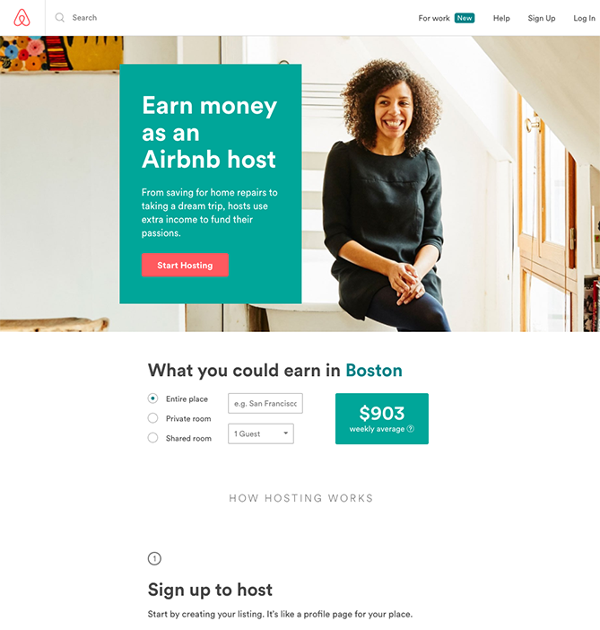
Show don't tell: If possible, embrace the show; don't tell mentality. Take a look at the landing page for Muzzle. This app silences on-screen notifications. Their landing page fires out an onslaught of embarrassing notifications on the left of the screen. It's not only funny, but it also captures the usefulness of the app.
Landing pages don't have to be static; you can make them interactive and personalized. Airbnb has gone for a similar method to convert visitors into hosts. Their page is personalized to the user offering an estimate of earning based on their location. Simple and effective.
Proof: Results are a powerful motivator (positive reviews, stats to inspire visual marketing efforts, social proof to establish trust, success stories, stats, testimonials from real users before/after testimonial, even embedded tweets).
According to research by BrightLocal, the average consumer reads 10 reviews before they trust a business. Reviews and testimonials up the trust quotient and increase landing page conversions. Including quotes from people in the field (those your readers will recognize and believe) say that they like your stuff. This is a nudge that tells them that your customers think you’re great.
Action: Your Call to Action or sign up form should stand out. Use contrasting colors and make sure the sign-up form uses as few fields as possible. Do you really need to know the gender or date of birth? Use as few words as possible to take someone's information while keeping it neat. You'll get a lot more asking for just a name and email address than you will every little piece of contact info.
Access: Make it as easy as possible for someone to use your form. For a solid set of best practices, take a look at Accessibility for Everyone, a handbook packed with useful content and design advice.
Lead bouncing: When someone clicks on your call to action, you want to make sure they stick with you. You have a smaller chance of people bouncing off your page if your landing page speaks directly to the CTA. For example, if your lead fills out a form to download an ebook, and is instead sent to a random webpage listing ebooks, they will be understandably confused, grow impatient and leave the page.
On the other hand, if you deliver a targeted page that applies to that specific CTA, you can hold their attention. You can also send them an email with the link to confirm their address is valid. ("This is the address we will send your eBook download link to.") This way, you sidestep getting fake email addresses plaguing your opt-in strategy.
Optimize for mobile devices: Want to miss out on most of the website traffic worldwide? Didn't think so. Make sure your page works on all devices, or you are essentially handing 60% of online traffic traveling via mobile over to your competitors. Pretty much all landing page software apps templates cater to mobile devices - more on this later.
Above all, be honest. You don't need to use a sleazy marketing pattern to make sales or grow your list. Remember to keep your copy simple, avoiding any industry jargon, and people will understand you: feature real results, impressive visuals, and real testimonials.
So you've thought about your lead capture landing page, and you've focused everything about the page on making that sign up happen. The design and structure of the form on the page is pivotal to its success.
Remember: lead capture pages reach out to potential customers who would otherwise be unlikely to purchase at the first point of contact with a brand. One thing to keep in mind is don't try and push a hard sell on people.
It will not only look desperate and spammy but defy the purpose of the form. Lead capture forms give consumers the option to ease themselves into an ongoing relationship with your business. A form leads to conversions. Now, here's what to do to make that happen.
Save time with a form builder tool
Lead capture templates help you build optimized lead generation pages even faster. It's possible to build HTML templates to use repeatedly, but this takes time and skills. Better still, use form automation software. Automation software like Leadformly and Formstack provide automated tools that hook up to your lead generation pipeline.
Form automation software doesn't just save you time building forms from scratch. As well as offering templates, they come with analytics to track and view leads and useful stats to hone in on prospects' demographic sets and geolocation.
Exit popups have a higher conversion rate than other kinds of popups. With OptinMonster’s targeting features, you can show your exit popups to the right person at the right time. You'll be able to see inside your funnel and make decisions about which people are converting with greater accuracy. This leads to a more optimized campaign and an increase in conversions.
The clincher is how easy form automation software is to use. Forms are customizable, with plenty of options to play around with from the layout and design to editable fields and many other resources. Expect drag and drop simplicity, which means no JavaScript, HTML, or any other coding, so you'll have no trouble embedding a form onto your landing page or newsletter.
Positioning
Once you've gone to the trouble of making a form, it needs to be positioned above the fold, or at least easy to find. Don't make them work to see it. Keep it visible; you want to draw people's attention to the form. There are two ways to go about this:
2. Alternatively, place it at the bottom of the landing page. That's right, against all reasonable advice, put it at the bottom. How? You need to place a CTA button above the content. Clicking this automatically scrolls the page down to a form at the bottom of the page. Why should you do it this way? To ensure that your perfectly crafted content takes center stage. If they decide they want what's being proposed, they simply click the CTA. This is a noninvasive, less pushy way to organize your page.
Form Length
Now over to how long your form should be. How many fields is a good number? It's a tricky question. Short forms outperform long forms; it's common sense. Not many people are enthusiastic about filing in information about themselves. It's tedious and time-consuming.
Also, it's unlikely that your leads want to receive calls or emails from you, especially in the early stages of them becoming acquainted with your brand. At the same time, longer forms generate higher quality leads since these visitors are willing to provide more information to get what they are looking for.
An important thing to remember: Short forms generate more leads, longer forms result in fewer, higher quality leads.
It's startling how much of a difference shortening a form can make. There have been many studies that reliably suggest how to form length impacts conversion rates. Most notably, a 40,000 landing page analysis of Hubspot users. According to Dan Zarella of HubSpot, conversion rates improve by almost half when a form is reduced from four fields to three.
Form fields
We've hypothetically positioned your form but sidestepped what information you are asking for. Regardless of the type of form you go for, ask only for the information you need to contact and qualify the lead.
Think about your perspective as a user: how many times have you been put off filling out a long-form? If you only need the basics, then ask for the basics. A newsletter subscription will only need an email address and first and last name at most. Ask only for the information that can help your campaign. After all, the most important thing you can do is follow up on your new lead.
Lead-qualifying fields
The purpose of determining lead strength is to find out how likely they are to become your customer. Marketers include some fields and questions in the form that give us some clues. For example, you can add fields like website, company, role at the company, and how many employees. How about adding a question to gauge how much they need your product.
There is a fine line between digging for some extra information from your readers and a full-blown interrogation. Ask only the questions that are necessary to contact and 'qualify' them. There will be plenty of opportunities to ask for more information later, and this is a better approach than asking a ton of questions to the detriment of your conversion rates.
Privacy
With so many stories of data leaks, personal information for sale, and sinister algorithms, you shouldn't ignore potential customers' concerns. It is better to be proactive. Think about offering reassurance and trust. Address concerns head-on and with honesty. People are wary of giving out their details, and rightly so. If you're asking for an email or a phone number, add some reassuring elements to your content, such as linking to your privacy policy or any guarantees you can offer.
To reaffirm your credibility, add a logo, any guarantee seals, third-party security certificate, customer testimonials, any awards that your business has won, any evidence to support the claims you are making, etc. Just make sure your site looks as credible as possible to reduce any concerns people may have when filling out your form.
Submission button
Finally: the clincher. The button your visitors must press to send you their information. While the go-to text is often 'Submit,' studies have shown that buttons labeled this way have lower conversion than words like "Click Here" or "Go." Top-performing variations feel less committed.
Get everything together that you want on the page. We're talking about photos, a virtual map, a manifesto about your beliefs, a demo of your products, and quotes or reviews. Now it's time to put your landing page together. There are three ways to go about this.
Using landing page builder apps
Unless you're skilled in or keen on coding, it makes sense to use dedicated landing page builders. The best landing page tools include professional web design templates optimized to convert visitors to leads. To find pre-designed landing pages a good website builder will help you out. If you already have hosting, check there first to see if there’s a website builder program included.
Landing page tools are template-based. To get started, select a template that applies to the type of page you want to make. Then click through the items you want to add, change, or replace with your content. Since it's a template, the top part of the page is ready to go once you've added your content. Just add your supporting content, like a demo, video, reviews, and anything else. Once you're ready, publish the site.
Once you've successfully motivated people to click your CTA, what's the next step? Now's the time to zone in on your leads. Don't leave them hanging. Your page is live, and you are getting sign-ups. What to do to convert these visitors into profitable customers?
Confirmation and thank you pages
It's just plain good manners to thank anyone who's taken the time to fill out your form. This is your chance to let them know that you appreciate his/her time, and if you have something else they may be interested in. Why not make another offer? The confirmation page is a great place to deepen the relationship with additional offers.
Naturally, your first thought might be to send a personal thank you note to all of your sign-ups. Unless you're talking one a day (we can do better than that), this is impractical. There are only so many emails and SMS messages you can write yourself. That's where we introduce automated workflows to the mix.
Automate your workflows
Digital marketing is a crowded workspace that includes managing your brand, advertising, and generating leads. It just makes sense to automate some of the tasks you would otherwise do manually. One way is to set up auto-response.
Auto-responding Emails
Keep in touch with your contacts over time using 'drip email' tools. Many landing page apps come packaged with these. Automated email tools let you add an entire workflow of emails, SMS messages, and more to stay in touch with your new contacts over time for basic marketing automation.
You can send automated messages to your new subscribers and easily stay in touch with existing contacts. Drip email generates unique emails for each audience member. Add a customized email that says thanks to people for signing up, shares more info, and pushes them a bit closer to buying your product. Make unique emails for each audience—remember, subscribers might be interested in something different.
How to measure results - rather than testing based on gut instinct, use your website data to show you what is and isn't working. The best time to measure is when you have some traffic, otherwise, you won't have the sheer numbers available to make an informed decision.
A/B Testing
There's always room for improvement, especially on the internet. President Obama mastered A/B testing and raised an additional $60 million for his re-election campaign. If it's good enough for a president to get re-elected, it's good enough for us.
Are visitors leaving the page before they get to your CTA or lead generation form? Are you not getting the results you imagined? Is your boss pressing you for more leads? A/B testing can help you edit your page based on real-time test feedback instead of guesswork. If you don't test your page, it won't get any better. So, how do you do that exactly?
A/B testing allows you to optimize your site to transform a visitor into a customer. It's an experimenting method where you test two different versions of your landing page simultaneously and observe how page visitors respond. This is a valuable method; you get to know what they like and what they don't like in your landing pages. Regularly testing different versions means you can measure and improve every aspect of your marketing strategy. And text ensures you have the best version of your landing page, optimized for more conversions, and more sales.
Stage 1 - Testing from scratch
You and your team likely have different ideas about which version of your landing page to run with. A/B testing app eliminates any guesswork. Reflect your ideas on each of your landing page variants, assign an equal amount of traffic to each, and watch to see who comes out on top.
Stage 2 - Optimization
Once you've gone live with the best version of your page, it's time to optimize it. At this point, we're going to zoom in on one element at a time: your headline, images, CTA button, etc. Always test one thing per test to find out which version converts better. Anything more than one, and you won't know what leads to a falling or better conversion rate.
You can test almost anything from your headline, subheadlines, colors, testimonials, images, videos, structure, CTA buttons, and different kinds of content.
Your headline is the most important element of your landing page. You only have 8 seconds to make an impression. That's why testing is crucial. The first place to start is your headline. The headline and the most common areas to test include body text, CTA, the form, the offer, try video, live chat, and trust seals. There are lots of landing page builders that include tools to help with this.
Heatmaps
Heatmaps give you real insights into your visitors' behavior to find which elements to test. Heatmaps track how users are interacting with a site. Marketers use these tools to discover specific information on which page elements are working, and what you should A/B test to improve your page's performance.
Data is anonymously collected, including mouse movement, clicks, and how far people scroll down a page, and colors represent the value. Since aggregate information is presented visually, instead of starting at a spreadsheet of numbers, it's easier to assimilate and make decisions.
Crazy Egg is probably the most popular heatmap tool right now, but there are many others. Mouseflow, which is a particularly good choice for WordPress users, and Heatmap.me, which claims to be one of the most straightforward tools for reading heatmap analytics. For an in-depth look at the best heatmap available right now, head over to this guide from WPBeginner.
Mission complete. Hopefully, you're ready to build a new landing page for your product, service, or marketing campaign without any snags. One page focused on one product or marketing effort isn't that hard to pull together. Well chosen headlines, an optimized CTA, you know the drill. These things can turn your product from something lost in the ether of the world wide web into a roaring success.
Look at your page. Do people know about the details of your offer, the benefits, and the context of how to use it? Is it explained in such a way to convince at the point of purchase? Is the only option to read an offer and click through to complete a transaction, or fill in a sign-up form? It's as simple as that.
What next? Don't stop at one. Keep the motion going. At some point, you might need more. More landing pages mean more conversions! According to Hubspot, companies with 10 to 15 landing pages increase the number of leads their sites generate by 55%. Now that you know what it takes, you can repeat the process as many times you like.

From content creation to SEO, here’s everything you need find customers and keep them.

 guideRead now
 10 minsguideRead now9 minsguideRead now6 minsguideRead now15 minsguideRead now11 minsguideRead now13 minsguideRead now7 minsguideRead now9 mins
 guideRead now12 minsguideRead now10 minsguideRead now13 minsguideRead now11 mins
Need help? We're always here for you.